Aloha!
Another great addition of eclectic games this week. Two math games this week... which is odd. Yet another shoot 'em up airplane game... which is fantastic. Love the genre. Finally getting back into the groove of streaming not so much with the writing. I have been busy as a bee working on a new side project. I will be teasing it on stream within the month or tw and the play test will be weeks after that.
Lets get into it;
- Far Out Finley by Ed Lytle
- Plato's Brewery By Varii
- Astro Wars By Azkalan Kan

Far Out Finley #
Math! Education! FUN!
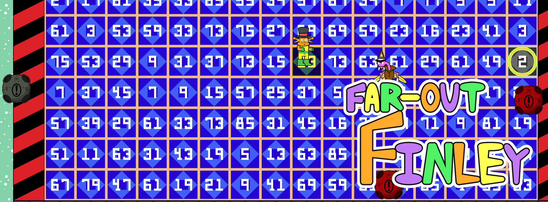
Three words I enjoy saying in a row when describing a game. This one brought me back to my childhood favorite game – math blaster. Overall, this was a well-made game. The art style was a bit childish. That is not a negative mark; the target demographic for this isn't picky about graphics, but they do require engaging gameplay. Far Out Finley surprised me in that regard, I wanted to keep playing until I beat it. I did not.
The Good
The overall mechanics were intuitive and required almost no explanation. I found the game play very engaging and quite a bit addictive. I actually wanted to keep trying and testing my math skills.
This was a highly custom project. From the animation, to the UX, to gameplay programming. It was also done by one person. That is always admirable. It feels impossible to be able to do it all. The key is striking a balance in all of the disciplines and finding the right things to put more time into. This game was very balanced and polished. Very impressive.
The Bad
While the gameplay is mostly intuitive, there needs to be SOME kind of explanation or introduction to the game play. A tiny level with some tool tips and step by step introduction into how, at least, the basic mechanics work would go a long way.
The Menu UX was rather disorienting. While I can admire the trailblazing attitude... conventions exist for a reason. In order to defy popular conventions like radio buttons you need a damn good reason.
The number range should fluctuate based on the multiple selected. When the user selects 2, the highest number I got was 18. This made it easy as the rest of the board was between 1-100. Instead of hard coding the range by doing $multiplier * 9, do (99 / $multiplier) * multiplier. This will allow for maximum variations for each multiplier.
The Ugly
There wasn't much here that was prevent me or anyone else from playing this game... EXCEPT THAT FREAKING buzzer. I hated it.
There was also a minor bug when getting hit while holding a number up, the card stayed visible. It would be cool to fix that and add an animation to trigger when you get hit holding a card.
Conclusion
I'm sure there are a wealth of educational games on mobile but it warms my heart to see one for PC. This is the first one I've seen on itch – I'm sure there are others, send me them!
I think there are possibly some balance issues to address, especially if this is targeted for kids (if it's not it should be). I would get some math enthusiast kiddos to test this if possible. Probably 7-12?
Anyways, I enjoyed this one and I think it has a lot of merit.

Plato's Brewery #
HOW DOES YOUR BRAIN WORK???
- me on stream
This was a fascinating game to me. This was a game jam game so there are different rules when critiquing them. I am a philosophy degree drop-out and I really enjoyed ancient philosophy. The cave alegory was... spot on. I really felt like I was in plato's cave interacting with platonic forms. It was difficult, confusing and made my brain hurt! JUST like philosphy school. I loved it.
The Good
Great concept. I love the on-the-nose bit about literally being in a cave. The core concept of throwing runes into a well was fantastic. I really enjoy geometry and patterns and figuring out how to manipulate the shapes to get a desired effect was a very fun challenge.
The music was also very good. A viewer specifically pointed it out and I agree. I'm assuming this was purchased or royalty free due to the game jam fact... but it was a vibe. 100% great choice worthy of mention.
The Bad
In general my largest comment is that this doesn't feel complete. Being dropped into this game is like a fever dream. There are mechanics and rules for successful potions. Good luck. I won't harp on this too much – it was a game jam – but the game definitely should have been reduced in scope for the time frame.
An example of something I would have cut is the whole throwing the potion into the pot. A simple list of your ingredients and a UI to manipulate and combine them would go far.
One very important feature that is not in this is direct and engaging gameplay that is digestible in the first 60 seconds. To fix this;
- Visual representation of stable / unstable
- get rid of anything that's not essential...
a) ditch the customer mechanic, just give the player a recipe every time they complete one
b) ditch the 3d potion model in favor of a list
For a game like this to be made in a game jam I would have straight up built the game in a UX like the purchasing of materials and expanded to a 3d environment once the core mechancis were done and engaging.
The Ugly
Not a ton to go over here (it's a game jam game). The look sensitivity was horrible.
Conclusion
solid effort for 4 days or whatever it was made in. The idea was a bit too ambitious and it shows in the lack of intuitive gameplay. I actually ended up looking at the itch page for an explanation of the stability mechanic... not a shining beacon of intuitiveness if I am on your itch page looking for hints. THAT BEING SAID... I enjoyed it. After I figured out what the game was ;)

Astro Wars #
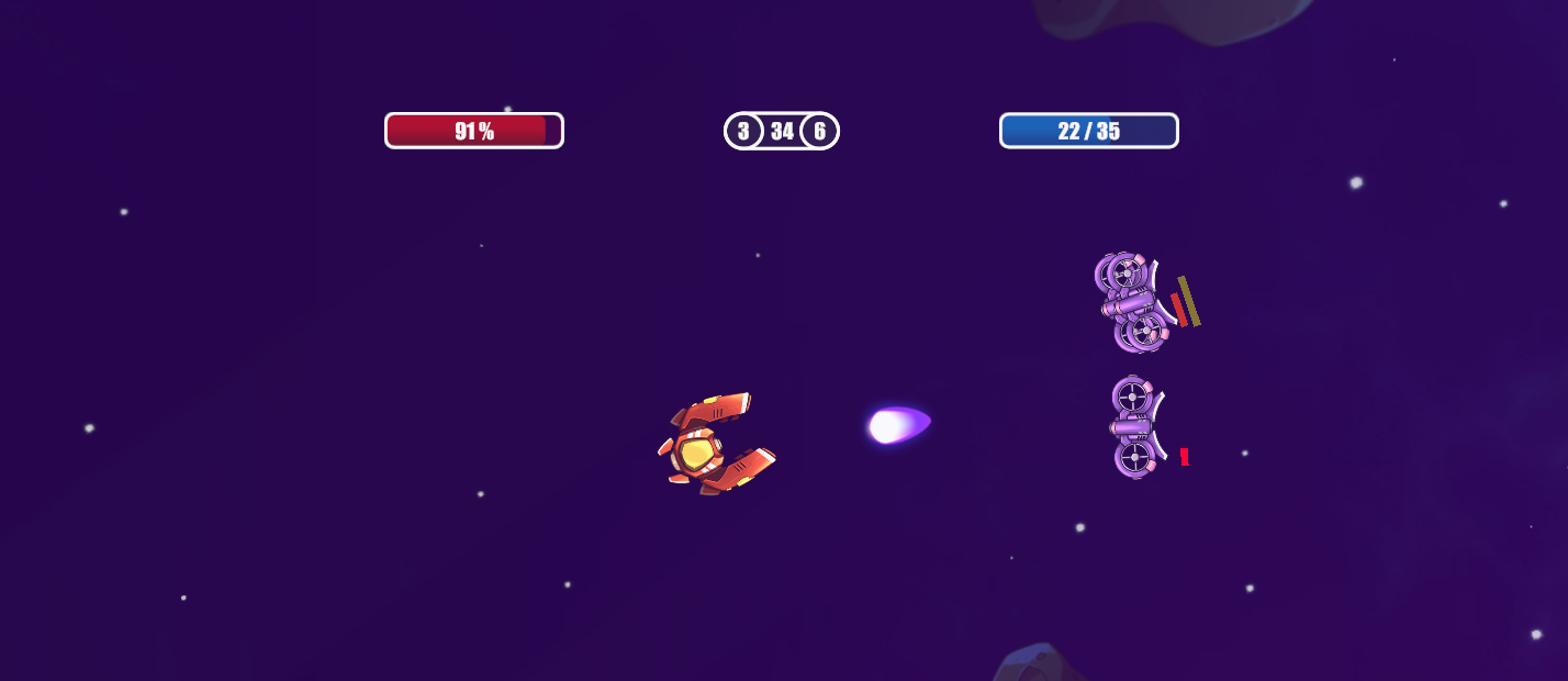
I feel like this genre is very approachable for game jams and beginner devs in general. I'm not saying this in a negative way by any means, it's just that I've seen so many of these. There is a very defined gameplay loop, it's 2d, projectiles an infinite ceiling of features you could add. Astro Wars definitely ticked the right boxes to feel good and engaging.
The Good
Custom models were fantastic. The art felt unique and cohesive. This is very important for this type of game. It's really all there is to stand out as almost every mechanic you can imagine has already been done.
The balance and challenge for each level was really solid. I felt like there was a lot of unique enemies and different situations that I was put in that kept me engaged. This is very well done for the genre. I've played many of these types of games since starting streaming 3 months ago and this one was easily the most balanced. I can tell the developer played a LOT of it and probably watched others play it as well.
The Bad
The music and environments felt repetitive. I would like to see more variance here, it would really add a lot to the experience. Not really much else to say that's a "nice to have".
The Ugly
While I appreciate custom UI. This isn't it. There are conventions out there for a reason and this UI breaks them for no good reason. Fortunately it's fairly easy to shift around
Conclusion
Great job. I would fix the UI and add in some variance to the biomes/music before a release and be happy with the rest of it. The developer intends to release this on itch.io for $1, so make sure to keep an eye out for that. PERSONALLY, I think throwing the demo up on itch and releasing on steam is the call. Beyond that with some solid music and more variance in biomes I think $3 is a fine price point. With early access it could easily be for $1 as I played it.
Thine Support Is Appreciated!
Do the things in the places;

