Aloha!
This week I tried a new time slot and it... didn't work out too well. Mostly because I was already working all day and got a gnarly headache. I managed to get two feedback sessions in. I will probably stick to the old slot. Such a bummer, I had a full two hour stream planned. Giving quality feedback is really important to me and I wanted to make sure the next two games got my full attention.
This week I played two very different games and enjoyed them both;
- Everchained - By Chief's Hammock
- Quantum Cortex - By QCDev

Ever Chained #
Initial Thoughts
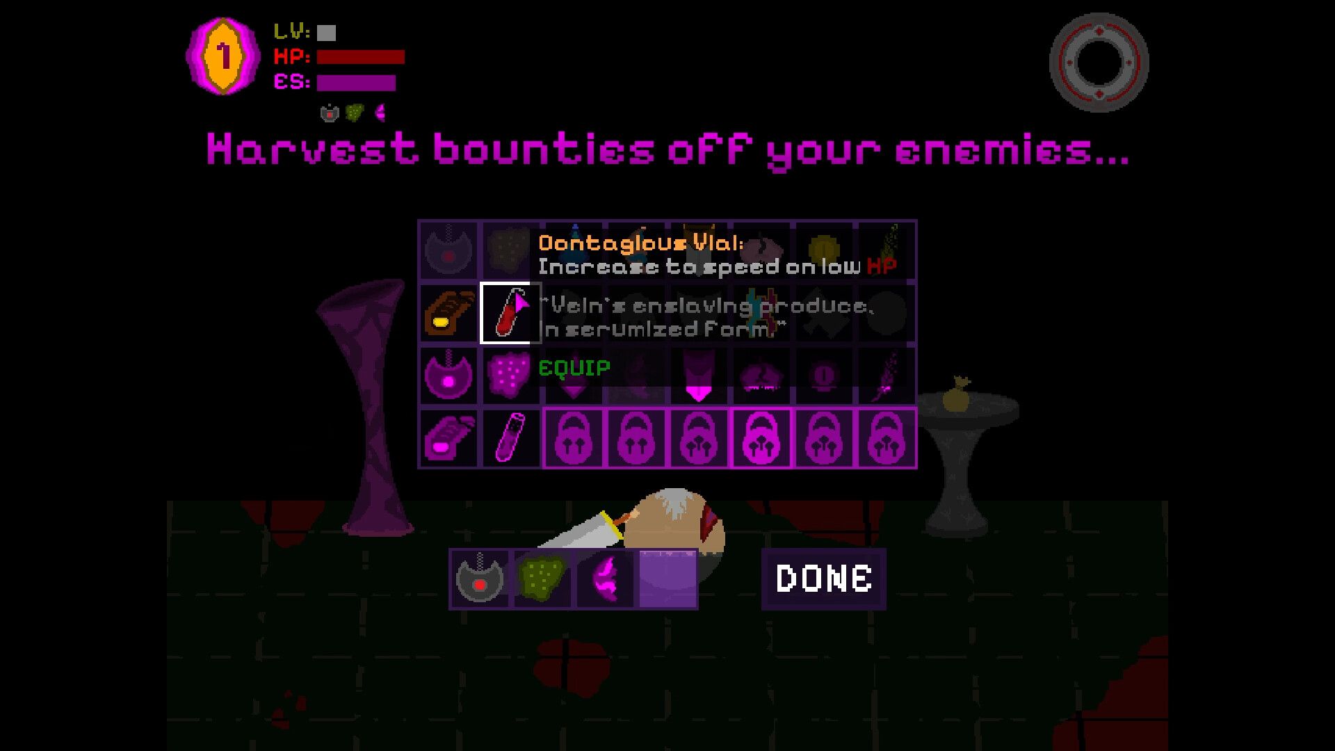
The intro screen is badass. It got me pretty pumped for what was about to come. I feel like I was thrust a bit too quickly into the deep end, which took away from the game play session. I unfortunately didn't make it past the first boss. Souls-like games are a genre I do not have a lot of experience with. You can see I had a lot of trouble with the dodging ability.
The Good
This game has a lot of charm for me. I really enjoy the artwork, even if it isn't the most sophisticated style, it is unique and clearly chief's own vision. It is all on theme and has a unique feel to it. The game felt polished and had clearly been thought out. The music was fitting and not distracting.
The one boss I fought was unique and had fun mechanics for your players to learn. It is definitely something that I wanted to continue playing once I started getting into a rhythm.
The Bad
Learning curve too steep
There is a very steep learning curve that is made worse by a lack of thorough tutorial. Here are some area's that could help make this game easier to approach;
- I was kicked out of the tutorial before I was ready. Making sure your player is ready is very crucial for a game like this.
- There is no clear feedback for how to maximize damage. I would like to see sound and visual feedback for exactly when I should strike to do more damage. Additionally, the font for damage numbers is unclear. I think I kept seeing a 2, but it looked like a letter.
- More forgiving timing for the swing. I am not sure how I feel about the sequence of commands I must press to attack, but they should definitely be more forgiving. Giving players visual and audio feedback for this will help... BUT you can see that even 15 minutes into my play that I am having trouble balancing attacking and dodging.
Ability Points
This felt bad. It makes me think of some advice I randomly saw on the interwebs... basically... "Most players don't finish games, make yours shorter". Your game has a ton of bosses for a $3 game. I think it would be a great change to keep your spent ability points after you die. This would require some changes to the cost and overall balance of these abilities. This would have certainly allowed me to beat the first boss in my initial play through.
The Ugly
I didn't encounter any bugs or game breaking situations. I feel like the lack of clear and thorough tutorial is ALMOST ugly here but I dunno the whole, "Good, bad ugly" thing is just a play on words. The lack of preparation is probably this games biggest issue for new players. e.g. if someone doesn't know what "souls-like" means they will not understand the invulnerability during dodging.
Conclusion
I think for a $3 game this is a good buy for those who are into the genre. After a player gets comfortable with the mechanics I suspect the game has some pretty fun and interesting mechanics. I will be checking this one out again when I have time.

Quantum Cortex #
Initial Thoughts
Boy howdy was I confused by the trailer. I had the impression that it was some kind of ball you were dragging through obstacles. The trailer is super fast paced and visually stimulating. It actually wasn't until I booted up the game and started that I realized I was actually a little robot dude walking around a level.
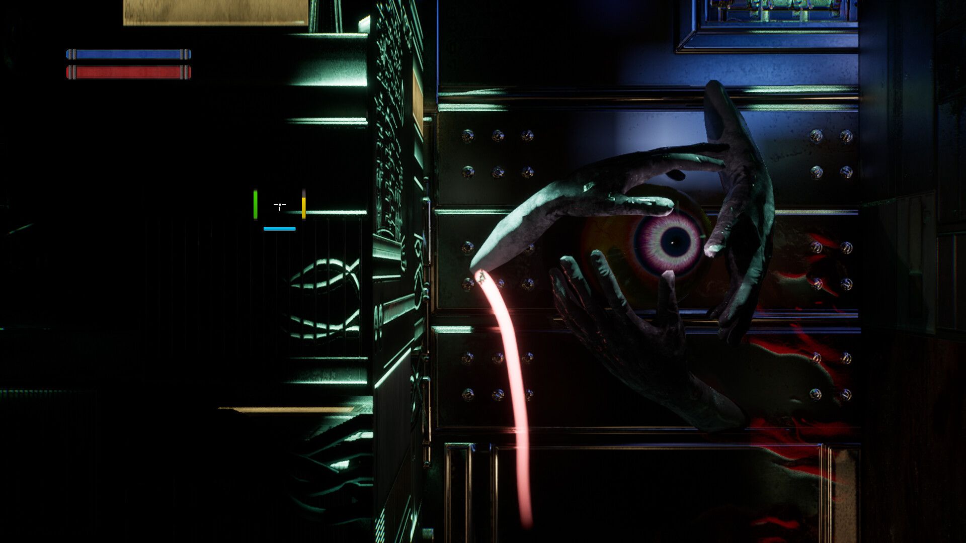
The aesthetics of this game are bad-freaking-ass. Really love the grim dark creepy feel throughout the whole thing. The corrupted bloody eyes on the wall are a nice touch. This game feels like sonic + metroid. Great work overall.
The Good
The textures and level design immediately stood out. This game uses unreal engine and they did a fantastic job on the visual effects. Super fast paced. Super visually stimulating. The soundscape on this was also noteworthy, bringing back some nostalgia for sure.
The movement for this game felt really satisfying (minus one qwerk detailed later). I enjoyed getting the hang of launching myself around. In the first 25 minutes I was slowly introduced to some pretty complicated movements.
The ramp up to difficulty felt nice... but maybe a little too easy. I think it does need a little more obstacles that are threatening, but beyond that it was a pretty dang good walkthrough.
The Bad
UI/UX needs work
The menu and UI are the weakest point of this game. I can tell how much work you put into the mechanics and level design, but the UI/UX feels a bit amateurish. There are some theme mismatches and odd UX. The checkpoint menu looks different and has some weird -> indicators. I know how monotonous it is to build out good looking UI but this is easily the weakest part of Quantum Cortex's aesthetic.
The ability / ammo UX needs to be moved to a static location. I honestly didn't even notice they were there until I booted up your game the next day to recall some of my notes. Make it bigger, make it in one location that is easy for the player to read. I think the refresh counter on the cursor is fine, just move the actual ammo count to somewhere and make it MUCH bigger.
Some Assets Don't Fit
I mention it in the vod, but some of the assets really don't fit into the grim dark feeling world. It looks very out of place to suddenly see flat green squares on the checkpoints and it felt like placeholder assets. Taking another broad pass at your assets and making sure they all fit is worthwhile.
Make a bigger deal out of important boxes
I think some kind of mini map or screen indication that a super important ability or item is nearby would be nice. At a minimum you need to immediately, on the first box show them this can contain something important. I think I flat out skipped some – I thought they were just currency.
The Ugly
Inverted Ceiling Movement Feels really bad
Straight up disoriented me at first, eventually, just frustrated me. I think this mechanic can be filed under "artificial difficulty". Man was it super disorienting and jarring to be zooming around the level, holding down the forward key, only to start randomly going the other direction. I see the intention here – you were thinking about how in sonic you hold one direction and you go through loops, etc. The difference here is that sonic can't walk on ceilings or walls, he can only ROLL on them.
This is tricky because I'm assuming this was not easy to do. Unfortunately it feels just... so bad. Furthermore, as an unreal developer who's spent a lot of time on movement components, this is probably going to be pretty complicated to get right. I think this mechanic is annoying enough to make me want to quit. This game is about speed, zooming around, and bonking enemies... to be taken out of the flow is really disorienting.
Conclusion
I think this is a rare and interesting metroidvania game in a sea of the same. The core of the game is good and the game play loop is quite satisfying. The difficulty ramp up was pretty good, albeit probably could be more challenging. If QCDev can figure out a way to make ceiling movement more smooth I will 100% be buying and recommending this to anyone into metroidvania.
Check Out My Game
I do more than just feedback! I am a little bit of a game dev myself. This project actually started because I found it genuinely hard to get feedback for my games, so I started "tricking" people into it by giving them feedback first... now I just do it for fun... BUT...
Please, if you are so inclined, check out my demo and give me feedback.

Next Week
Still no access to Crete, but man I am chomping at the bit!! I also have two more games that I delayed due to my headache. If you are reading this and would like to apply, please do not hesitate.
Cheers – Keep on creating!

