Howdy Folks!
This weeks games were pretty great! Three very distinct games that I enjoyed! I gotta say I wasn't sure what to expect for frog attack and you can hear my audible surprise when I gobbled up a human. I've started to garner a couple of regular viewers which is fun. I do this for my own enjoyment so it's really no big deal either way but it is sure less lonely! Stop on by next week to join us at 1600 GMT.
This weeks games;
- Frog Attack - by Popi
- Haunted Crescendo - submitted by Regalia Rose (5 person team)
- Blother - by MOHMOH

Frog Attack
Play In Browser | Poppi's itch page
Now, it is important to note that I will not turn down any game submitted and I always play with target demographic in mind. I foolishly assumed this was for children. Whoa buddy... what a surprise. It brought me joy realizing that my purpose was to consume human flesh. What that says about me? I have no clue... but good lord was that first gobble, and it's SFX brilliant.
The Good
The entire concept is weird... and fantastic. Maybe it was the shock of that first person being wrapped up by a disgustingly long frog tongue and swallowed? maybe it was the sound effects? Either way there is something wonderful about how unexpected the mechanics were.
Also while I understand the art direction was a bit... childish... it was endearing. I always... always... ALWAYS... enjoy custom artwork no matter the quality. Frog Attack's models were very casual but endearing.
The Bad
The puzzles where not that great. The ones that were solvable for me were probably a bit too easy. I think it was likely a fun exercise for the developer to come up with different mini games but really just kinda felt like chores.
In general I think some effort on working towards making more engaging and interesting puzzles would go a long way. The sound design and zany mechanics were enough for me to forgive this but the actual puzzles need some TLC.
The Ugly
There was one bug that required me to restart the level. I don't know how to replicate this but I think I clicked after the win condition? Who knows... Infinite eating glitch achieved.
I think the fly puzzle is unclear enough to classify as bad. This needs clear instruction or a more intuitive win condition. I tried... way too hard... to solve this and figure out what I was supposed to do. Generally speaking, as a developer, one does not want players to feel like they are dummy dum dums like I was feeling.
Conclusion
Charming. I know that's an odd description for a man eating frog game where you ruthlessly swallow people whole... but charming none-the-less. The juxtaposition of the music and the hand drawn paint graphics with a square frog DECAPITATING AND EATING PEOPLE... is a great thing.
I am unsure of this individual's plans for this but with a little bit of polish I can see this being a cultural icon for young children around the world who's parents would never recognize their kids are eating humans alive. Like seriously I would probably let my kid play this without even giving it a thought. "Could this innocent looking game possibly, in any dimension, be inherently violent? NEVER". Great work.

Haunted Crescendo
Download On Itch | ReliaRose | Watermylon | Uncle Skeleton
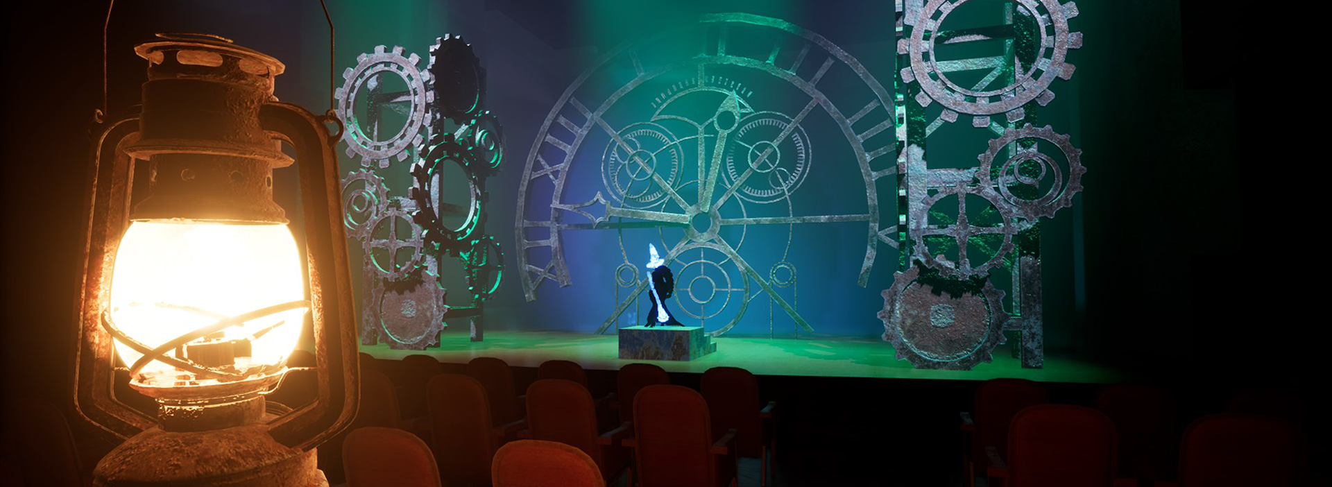
Haunted Crescendo is a submission to the Iron Mouse game jam months ago! YES I am that far behind on blog posts! This is a horror game where you walk around a mansion trying to find memorabelia connected to Iron Mouse's ghost! There is a creepy dude who follows you and if he touches you... DEATH! Throughout the level when a new accessory is spawned, you have nothing but the angelic voice of Iron Mouse (seriously what a voice) to guide you to the items.
Now, I hate horror as a general rule... FNAF has zero appeal to me. I hate being scared. This was not nightmare fuel like FNAF... BUT it definitely made my butt pucker. This playthrough was fun for me. This was a handful of games I've played (up to this point) with the developer watching. I'm glad they were because being thrown into this haunted mansion with ZERO direction would have been probably pretty boring to play and worse to watch.
I picked the normal game format instead of the game jam one because... ya know... I wrote all this and forgot that I did that so... here we go!
The Good
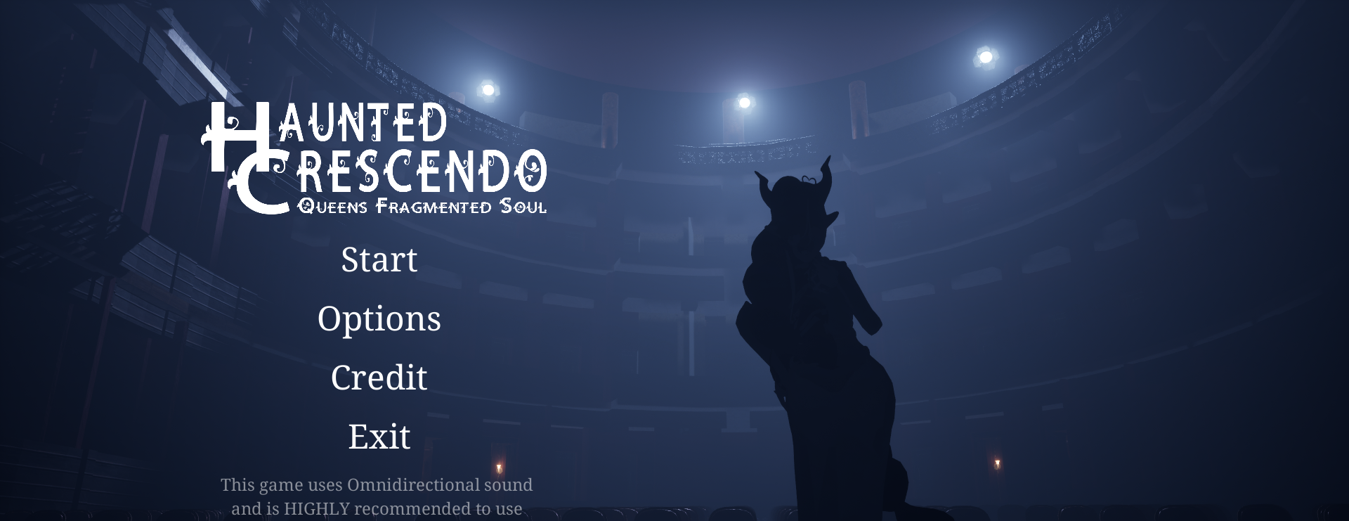
The art direction and world building were stand out for sure. Boy howdy was that menu pretty. It may sound a little bit of an exaggeration but menu screens are massively important for a game jam. It's something that buys a lot with prospective users. I think of a players attention like a gauge; when it bottoms out the player quits... and a fancy menu adds to that threshold. I am more likely to forgive any immediate transgressions or bugs if the dev bothered to put a fancy menu in. It's a confidence thing; "I am so confident in this submissions gameplay that I spent valuable time making a menu".
It's also important to note that this was a mix of an asset pack for generic assets (tables, chairs etc) and the key elements like the theatre, monster and puzzle pieces were all custom. It's a coherent world and that can be very hard to do w/ custom assets along side asset packs. Stand out job for sure.
The feeling of running / hiding from the monster was definitely terror inducing. The sound and screen overlay gave me intense anxiety and I hated it. Good job.
The Bad
At times the AI felt too hard while at others it felt too easy. Fixing this aspect of the ai, and re-examining it will not be easy. Honestly, for a game jam, it's quite nit-picky for me to ask to spend more time on AI mechanics. This requires exhaustive play testing from players who do not know the game.
I think for the jam it wasn't bad... BUT... I gotta put something here, so... here we go!
Currently the ai works by forcing to be respawned near the player when the player exits a certain radius. So, in order to explore how to fix this try tweaking the following;
- Radius which triggers respawn
- How close monster spawns to player
- How aggresively the monster pursues the person
- How easy it is to hide
I cannot possibly give specific direction on these values without actually playing them. It's also tricky for a developer to test this themselves as... ya know... they are acutely aware of how exactly the ai works. Again, excessive play testing would be required to address this.
The Ugly
The start was pretty rough. I had... ZERO... direction on what to actually do or where to actually go. I spent the first bit just straight up walking around this massive level. I think just starting the person in the theatre room would be the quick and easy fix. A more user-friendly tutorial and intro into the world would be the harder thing to do.
Conclusion
Overall I had a great time. I found the world I was thrown into to be engaging and compelling to explore. I feel like a little bit more prompting for direction on the player would be nice. There were times when I had no clue how to get closer to the sound. Perhaps a revisit to the layout of the level? I'm not sure.
Either way this was a compelling game jam game and the team should feel proud! Good job my dudes!
Blother
Play in browser | MohMoh's LinkTree
Nice action packed and small game here. There is no game too small for me to review! In fact, I find the smaller games like this who know their depth to be more compelling than a game that doesn't have clear direction.
The art on this one slapped me in the face. It reminded me of a 2d duke nuke'em for some reason. While I did struggle with my rampent dyslexia on this one, it felt pretty engaging.
What stood out?
Man the artwork on this one was slick. The animations were satisfying. Once I grasped the game loop it felt satisfying.
What needed more time?
I was very confused by the general mechanic. You can see me struggling to try and mow down obstacles improperly. There were flashing arrows prompting me to choose a side and I took it to mean, "SHOOT AS FAST AS YOU CAN OR DIE". A simple fix to this would be to literally prompt the user to choose. Bonus points for adding an animation to fail conditions. I actually had to message the dev to make sure I wasn't experiencing a bug.
What needed less time?
I think there wasn't really anything that felt like a waste. I use this metric to hopefully get teams thinking about doing the right work at the right time. I don't really think there was anything that needed less time, just really the design issue with confusing me to pick a direction. So maybe less time coding in general and a little more time watching a play tester experience the game.
Now, I can hear you saying, "PLAY TESTER? THIS IS A GAME JAM". Ah, yes, great point. Still, 5 minutes watching a tester play this game w/ zero prompt would have saved this design decision. It's always worth taking the time to watch someone experience your game unprompted. Don't have someone in mind to test? GO FIND SOMEONE. Offer an exchange of testing.
Conclusion
Dopamine inducing for sure. I can see this type of game being a good time killer game on mobile. The graphics are good enough to draw people in, with a little bit of polish I think this game is worth fixing some UX issues and releasing. Why not?
Thine Support Is Appreciated!
Do the things in the places;

