Woooo Two months! It's been a blast. Most of my free time has been going towards finding and giving feedback for games.... zero complaints here. The quality of some of these games over these weeks has really hit me in the face, and this week is no different.
I'm a bit late on this post as I ATTENDED MY FIRST LAN PARTY IN 20 YEARS!!! The boys are back in town and we were gaming until our eyes bled. 10/10 weekend escape but boy howdy... we aren't as stoic as we used to be.
Lets get into it! There was quite a spread of games this week. Tower defense, a roguelike dungeon and a retro 2d platformer. All of which were very quality and had very intentional and unique mechanics.
Check out the stream;


Kingdom Defender #
Play in Browser | Lef's Itch Profile
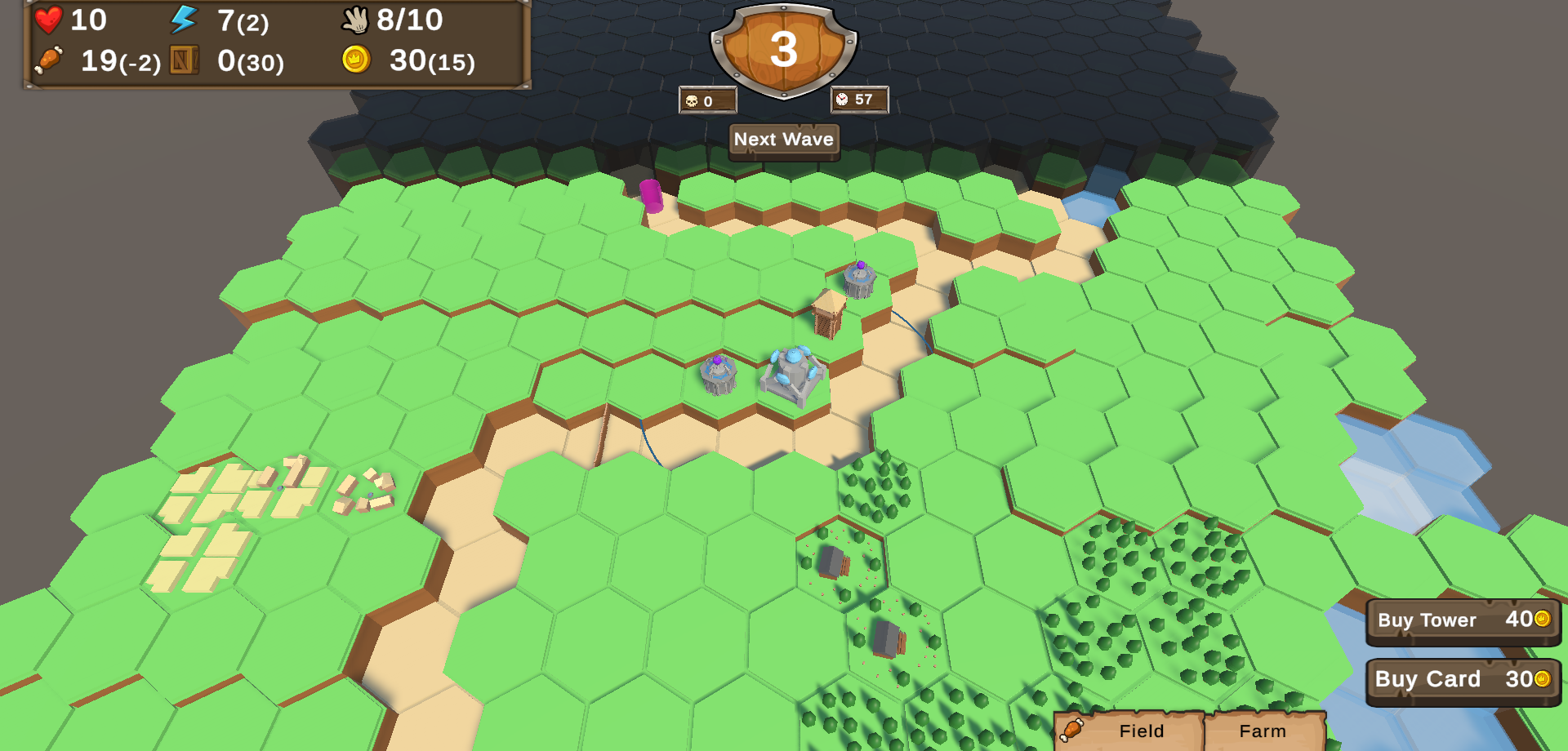
This was a very promising beta in my eyes. It has the right emphasis on the core of the game play. A lot of projects seem to neglect this and focus on aesthetics. Placeholder assets can be looked beyond, but a sub par game play loop will kill a project.
Kingdom Defender is a deck-building tower defense game. Players are given a isometric view of a hex grid. This grid changes every play through and contains paths in which your enemies will go as well as areas designated for building. It has elements of RTS (upkeep, resources, etc).
The Good
The game play. Fantastic. The vision is very solid for the core loop here. The time that was spent on aesthetics and world building was well spent. It is enough to convey the point. This is often the crux of solo game dev – just good enough to move on. It would be easy to spend days on modeling enemies; but fancy models don't win you players if your game sucks.
I think I was most impressed with the UX. The hex grid system was pretty solid. I did find a couple areas hard to click so it may be worth looking into why I was having trouble clicking certain squares. None-the-less the cards, HUD, and general UX was quite smooth.
I cannot emphasize enough how this effort on this project was focused in the right places. No one will care about the placeholder assets. Everyone will care how fun your demo was.
The Bad
One of the areas that was to be focused on was, "if enough info is provided to understand the game". Let me first state that while there is a guide, I honestly don't remember seeing that. I think it's safe to assume the majority of players will skip this.
That being said, this is the area to focus on next. I think most players who download a tower defense game will assume they can just trudge through it all. I can be seen figuring out what all the symbols meant as I went on, which is a testament to the games system design. As guide's or tutorials are a bit dated, it would be better to simply demonstrate what these mean in a players first game.
This may not even be necessary with some careful UX tailoring;
- Population UI was unclear. Instead of telling me how many more I can build, show me the totals as RTS's like Starcraft do. e.g. 11/13 buildings built.
- Upkeep was confusing. I wasn't clear on this mechanic upon playing. At one point I ran into a deficit and thought there was a bug. For this I think showing the players current upkeep along with their total food would be a positive change.
- Trigger some animations when players HUD changes.
I feel the need to emphasize "the good/bad/ugly" is just a stupid play on words. This stuff isn't "bad" it's really just what a developer should focus on next. One really powerful UX feature would be to prompt the player on what they can do to perform the action they wish. There were plenty of times where I was trying to place a tower or farm and I had to look at various buildings to figure out how I could a) get more population or b) more building materials.
The ugly
No sound is a HUUUUUGE opportunity for improvement. The rest of the game was so well ironed out that I didn't even notice until 2/3 of the way through. Music and SFX are easily the lowest hanging fruit for improvement. There are tons of royalty free assets that can be used out there.
I found it annoying that I couldn't click/drag the cards. I remember the first time I played this I was really confused and I was constantly confusing my the lack of click/drag with my inability to do a thing.
Conclusion
Fantastic demo. The vision is depicted clearly. The game play was fun and satisfying. A lot of games are too easy, I think this game strikes a nice balance. I was punished on my first play through for not knowing the mechanics and the next I was able to go much further with the understanding I had gained.
I would like to add feedback specifically about the deck building. I found it novel and a great addition to the tower defense genre. I did feel that I got stuck one time due to bad draws, maybe that's part of the fun in this game. Honestly, I think the game would be lost in a sea of tower defense games without this mechanic. Great work Lef, I look forward to seeing how this one evolves.

Tilemancer Dungeon #
Steam Demo | Follow on X | Itch Page (LOTS of games)
This was an entirely unique game for me. I'm sure there are others out there like it but I've yet to see it. In this game you are provided a top down view of a grid. At the end of the grid you have a boss. Players are given sets of tiles with variable exit paths (like pipe dream) and are asked to build a path towards the exit. It felt like a puzzle dungeon crawler... thing.
I feel like this game is very polished. I didn't really even take many notes as I didn't really have too much to critique!
The Good
Great vision execution. Even if this isn't entirely unique, it's well done. I actually recommended this to a good friend of mine that I believe will really enjoy it. Once you get the feel of the game, and how to build robust paths, it is quite a pleasant puzzle to solve.
The walk through of the mechanics was quite well done. Beyond that the mechanics where really fun and rewarding. The ramp up to difficulty was also quite balanced for the content I did experience. I feel like it would be interesting to see how the difficulty scales up later.
The UI/UX was fantastic. Very well polished. I found it very intuitive to pick up and the care that was put into it really stands out.
The aesthetic was perfect. Great selection of assets.
The Bad
My old ass eyes did have a hard time reading some off the text at times when I was all the way zoomed out. I think something could be done in that regard. Either an "old person mode" with bigger text or just some kind of dynamic UX that depicts the tiny numbers (damage/monster health).
There was a point where I felt it would be useful to plan out a path. I think being able to place pieces, form a plan, then submit them would be an interesting thing to explore.
I also feel like the mechanics walk through needs to emphasize the deck shuffling of the discard pile. This was a minor nitpick I discussed with the dev on stream.
Additionally, in hindsight, I do feel the general aesthetic and asset decisions where fantastic... I just feel like it does need more. More characters. More monsters. I'm sure that's on the devs mind and I'm being hyper critical here.
The Ugly
No bugs. Nothing ugly. Good Job.
Conclusion
I would like to see the final version of this. I found the game engaging and something that I could see myself playing. I do think this game has a lot of potential. The groundwork for something great has been laid. Without changing direction I believe this game will be a success.

Gravity Storm #
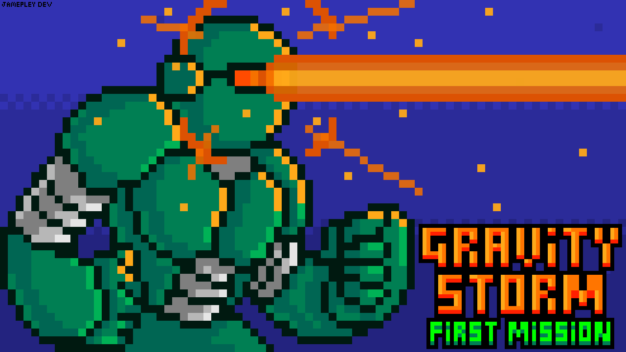
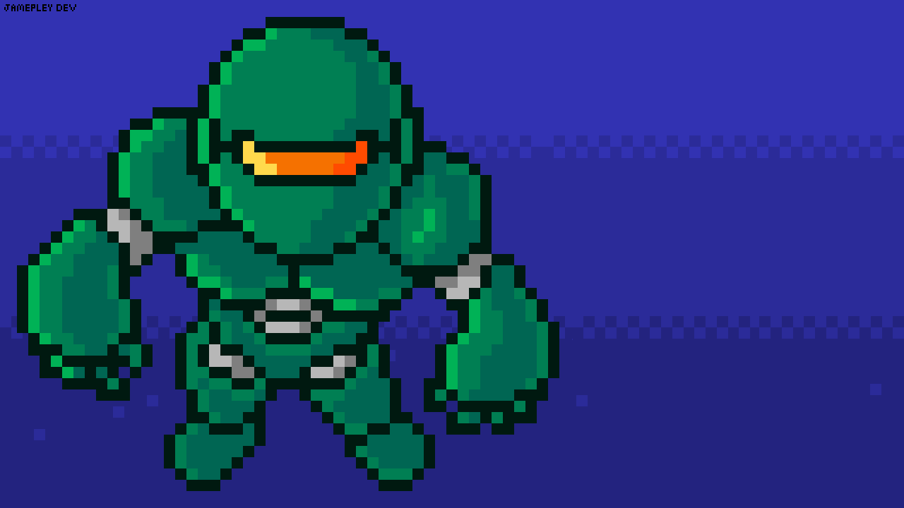
This was a really eye catching platformer I found in Juniper's Family Tree that I originally noticed because of the cover art posted. I really enjoy the art style on this one. I always appreciate original works of art and this one felt like it had a lot of TLC put into it.
In this 2d platformer you are a robot that can control gravity for yourself and the enemies. Let me just say that up front I really struggled with this one as a dyslexic. I found this mechanic fun regardless, and anything that I was mentioning on stream is not to be taken as a slight against the game.
The Good
As I mentioned I really enjoyed the artwork on this one. The main character was really well done and each of the enemies was well crafted. The animations were smooth. Even the background images where solid. I did mention at one point one of the obstacles looked squished but that was super nit-picky.
The SFX were really solid on this one. It felt immersive and really added to the already polished aesthetic. The sounds match your artwork nicely and the music in particular was really nice.
I really enjoyed how you kept score. I feel like that element hasn't been present in many platformers I've played lately. It definitely gives me a little dopamine hit when I do a bonus-worthy thing.
The puzzles that I did come across were really fun. I think leaning into that type of mechanic and playing with ways in which you can leverage the gravity in the game are definitely worth expanding upon.
The Bad
I felt like some of the enemies were a little too easy. I gave some pointers on how that may be achieved on stream, but one of them was to make the little floor/ceiling mounted guns could aim at the player, and decreasing the trigger box for the red claw traps.
One thing that felt really bad is when I accidentally instagibbed myself. I think it's ok to instantly kill the enemies but the player probably should get a pass. Just doing a significant amount of damage would be an improvement in my opinion.
The Ugly
I can't really think of anything I'd classify in the game breaking category.
Conclusion
Really solid start. I think this game is definitely fighting an uphill battle with the genre it's trying to break into. 2d platformers feel like a really saturated market... but this one can break through if the quality continues. With some more difficult and variable game play I think this will be a captivating. Leaning more into the puzzle factor could be interesting.
Wrap Up
Very polished games this week. I enjoyed playing each of them and sortof have trouble picking one that even really stood out. I think the gameplay of Kingdom Defender wins, while the mechanics and overall vision of Tilemancer wins. The artwork from Gravity Storm also stood out. Each of them are worth exploring further.

I appreciate your support!
This is a passion project for me, so I appreciate all of these developers putting themselves out there and letting me give them some public feedback. If you enjoyed this content and would like to support this channel please do the things;
PS - Here are the games we played at the Great LAN Escape of 2024;
- Chivalry 2
- Gauntlet
- Heave Ho
- HL2: Deathmatch
- Minecraft Dungeons


