Buenos Dias!
Wow. I am a month behind on blog posts! YAY! On a personal note I started a new job so I've been a little drained and busy. Mainly these FREAKING VACATIONS... whoa is me! My beautiful family dragging me away and distracting me from my true purpose... game feedback... /s ... No but really; I'm trying to play some catch-up on not only the blog writing but also the feedback sessions.
I'm not sure if it's a good thing or not to have so much time between writing these posts and actually playing the game; probably NOT... but... to look on the positive side I really get to watch my own content to remember how I felt. Holy shit my mic is trash.
Anyways, episodes games contained two puzzle games and a game that reminded me of super mario 3 multiplayer stage. This week was also three game jam games! I still haven't settled on a format but this week I did the whole, "What stood out, what needed more time and what needed less time" bit. I think its good, dear reader, what do you think?
This weeks games;
- Mini Morph by JGG Log and Gallo Pinto Games
- Survival Lab by Wearritt
- Cosmic Reclaimer by Bearded Cynic

Mini Morph #
Download on Itch | Gallo Pinto (twitter) | JGG Log (twitter)
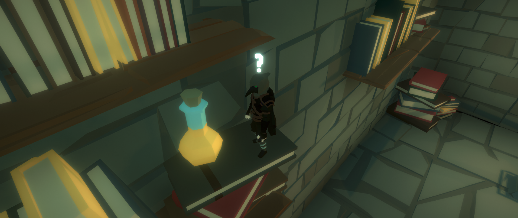
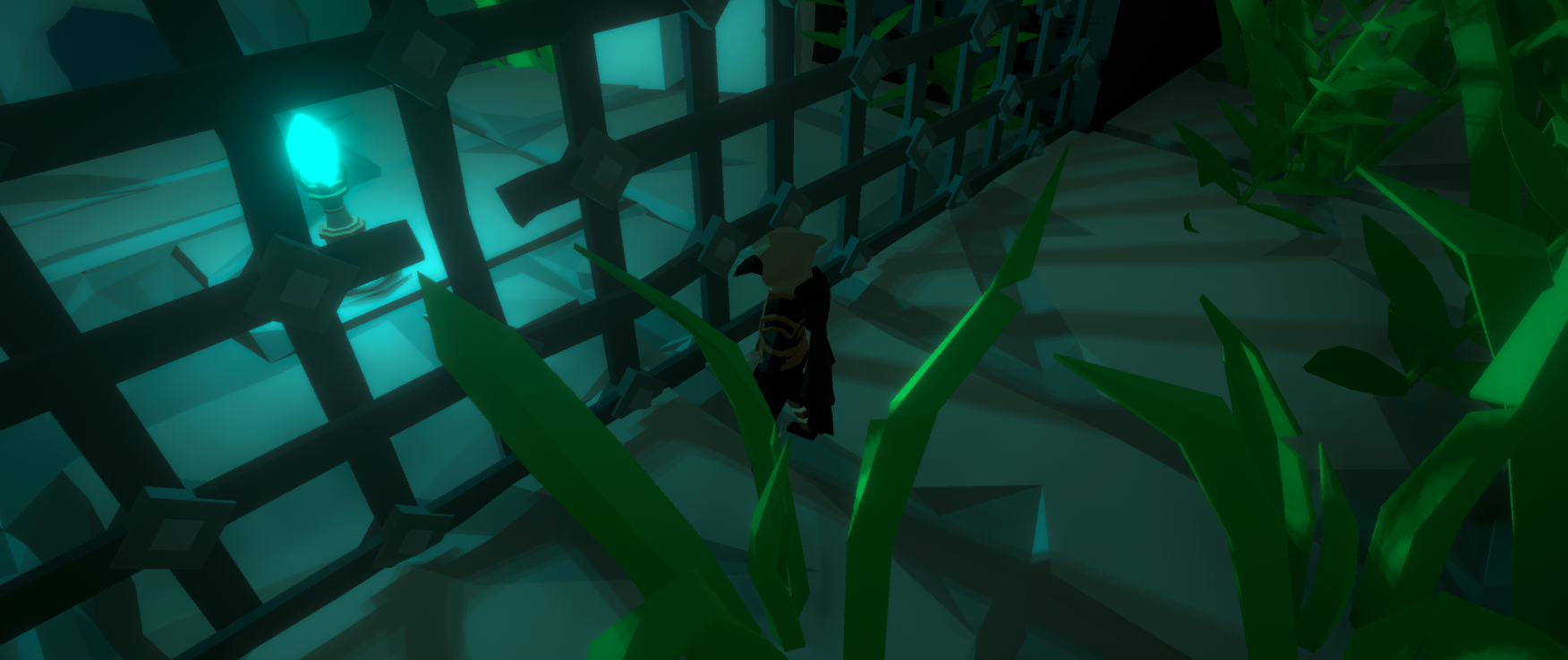
This was another submission to the GMTK Jam. This was actually one of the better game jam games I have played to date! The asset selection and art direction where all very nice. The music, which was a team members production, was a very nice bow on the top. Most importantly there were no major bugs, no major hiccups or issues with player direction.
What Stood Out
Again, the overall aesthetic between the asset selection, level design, vfx all tied together nicely. For a game jam game this is easily the first and important set of boxes to check. If a game does not have a distinct and tied together art direction it just won't get traffic.
The second most important piece is actually the gameplay. Not just the gameplay, but to immediately capture a users attention with gameplay. This game definitely pulled me in right away. The grow/shrink mechanic was well done and engaging. The puzzles where well built and challenging without being "fake" difficult – as in there were no just annoying mechanics hidden as "puzzles". It took the right level of exploration and experimentation to get to the goal.
What needed more attention?
Really not too much that I would have liked to see in this game for such a short turnaround. The SFX for finding a secret was quite underwhelming, make it more grandiose.
The biggest issue I had with the game was the camera. I feel like it was a little too static, and not positioned quite as I'd like. The shrink/grow mechanic should necessitate a change of angle. Personally, I'd prefer a free form camera (think 3rd person MMO w/ camera on swivel) OR a Mario 64 style camera with rotation. If a static camera is really desired then I would recommend the following;
a) Big -> Camera should be level with the shoulders of the player, MAYBE pointing down.
b) Little -> Camera should be pointing up.
What needed less time?
So with any short game jam game the economy of time is the biggest challenge. For this game I don't really know what could be cut to make room for better camera movement or SFX. I think the only option would be to make the game like 10% smaller. There were 15 secrets, i found 5, probably make it just 10 and fix the camera / add some more SFX.
Conclusion
Overall this was a fantastic game to feature. I think this one would have not registered as a game jam! I think part of that is the asset selection and overall vision just felt really tied together. Smooth gameplay, clear goals and objectives with little prompting, puzzles that were the right kind of challenging. Overall great work! The developers have stated this is the end of the line for mini morph, so don't get your hopes up for a full release ;)

Survival Lab #
Survival lab was another game jam. This was a interesting one for me. The art was pretty low fidelity and kinda "amateurish" but that has charm for me. I really enjoy anyone who has a vision and executes it by themselves. This was a solo dev who was abandoned by his usual team. Yes, this entire project was made by one individual. Revel in the glory.
A simple concept with quite good execution.
What stood out?
The custom artwork and art direction immediately stand out. Like it or hate it the style is unique. Personally I find them endearing and enjoyable but if you need hi definition graphics this probably won't do it for you. The gameplay loop felt well established and also stood out. I really enjoyed the concept and reminded me of the super Mario 3 multiplayer mode.
What needed more time?
While the gameplay loop felt established and well tested, I didn't really like how items worked overall. Picking them up/dropping/swapping items felt a little buggy. There were moments where I was a bit frustrated by trying to swap items. In general this is the only real major thing I would have liked to see more polish on. Here are some ideas for items;
- More balanced - the fire rate was the obvious superior power-up
- dropping an item on top of another should just swap them.
- better RNG - the victory condition came up really quick at times, it seemed.
- The whole mechanic was under explained / not intuitive.
What needed less time?
I want to say this the right way to not take away from the art direction. It's not the highest quality but it is complete and coherent. Those are definite positive marks. However, this exercise for me and the developer is one where we take a look at what was great, what wasn't so great and where their time could be spent better. The custom models, depending on how much time was spent, may have been better spent elsewhere.
Game jams are tricky because, as this user said, "I do these to expand my skills and add to my portfolio." Now, if this was an exercise in asset development / art... change nothing. It would be really silly of me to say, "Spend less time on the thing you wanted to get better at". This section has nothing to do with the developers goals for professional growth and is from the perspective of "what would make this game jam better".
Conclusion
Overall an endearing game. There were no game breaking bugs, the gameplay was understandable in <5 minutes and had a solid game play loop. WHO CARES about really anything else. Many game jam games don't make those points and it is a testament that this was finished so quickly. Great job.

Cosmic Reclaimer #
Oy vey... another stream where I botch the video. Sorry BeardedCynic... my OBS setup / control is amateur at best. ALSO another game jam game. I think there were several game jams going on at this time. Great stuff. The trend of game jams will, honestly, do wonders for the game industry in the future. I often reflect with awe and reverence to see what Thor has done to revitalize this industry.
Anyways... puzzle games! game jams! huzzah!
Aside from the botched video this game went pretty smoothly. I did re-record that section because there was one little level design bit that I wanted to comment on. Overall it was a pretty simple puzzle game. This was another GMTK game jam game, so I am not really keen on being overly critical with this one... aside from the music which bored its way into my very consciousness.
That being said it didn't really have the same feeling of completeness some of the other game jam games I've had. It's not really even about the asset packs or selection. The models, textures and assets where great. It was something about the world that lacked depth. I can really feel the difference in level design compared to a game like Mini Morph. I don't usually compare games but it's just such a stark contrast there and is a real opportunity for the designer of Cosmic Reclaimer to learn.
What stood out?
The asset selection was good. I mean just look at that render I took from their itch page. Very high quality. I feel like the models and textures fit very well together. These were asset packs (listed on the page) and they are quite high quality, fitting together nicely. In particular the VFX for the explosions and lasers were nice. These are good enough to really lean into showing them off!
What needed MORE time?
Music. More of it. Less repetitive. I am excited for the rest of my life where I will not have to listen to that repetitive melody again.
The level design was lacking. Between it feeling a little too blocky and obvious in some spots, there were several spots where this linear and clearly laid out puzzle was missed by my feeble mind. This left me in a state of confusion as to how to even progress. The main spot I point out in my re-recording where instead of the usual trigger with a terminal to grow the cube – it was just a grey 3d box. It is important to train players (the first cube / terminal) and not switch that up on them without any warning. I can assume that there was just not enough time to get this in there or it was just missed due to the hectic nature of the game jam.
I mentioned in the playthrough that some cut-scenes would do wonders for the game in terms of leading the player. It would also be an opportunity to show off some of these high quality assets! Speaking of camera stuff; I would also like to see the camera controls revisited – the rotation felt sluggish.
What needed LESS time?
The animations where bad enough / mismatched that I'd recommend just not including them. In fact it would have been better to just remove the whole "vault/climb" mechanic altogether and throw in a jump. All time spent on this mechanic was wasted and better spent on level design. It felt tacked on; these types of mechanics belong in a fast paced game like Mirror's Edge. This animation was clunky and just quite frankly didn't fit.
Conclusion
Please, if there is anything to be done it's to switch out that cursed music. At least add some more tracks. Overall, while the game did feel a bit dry and lack depth; it did have it's redeeming qualities. I really enjoyed the models and textures. The VFX and SFX were fun and added a lot.
I think this was a great excercise for this team, just possibly bit off a bit more than they could chew. It feels like they wanted to do a lot more with this idea and ran out of time. My overall advice would be to focus more on buliding a immersive worlds that don't feel so blocky. This may feel impossible in the scope of a game jam, but it's totally doable with practice. I think in general it would be a good excercise for this team to take on a longer standing project and learn what it means to refine an idea a bit more.
Thine Support Is Appreciated!
Do the things in the places;

